What is my screen size? The quick answer
“Screen size” can mean two different things. It may refer to your display’s physical diagonal size—usually measured in inches—or to its screen resolution, measured in pixels. If you need the number most websites, designers, and support teams ask for, they usually mean resolution.
Your screen resolution is available instantly.
Visit our free what is my screen size detector to see your current width, height, viewport, pixel ratio, and display details automatically.
You do not need to install software or grant permissions. A browser can safely read basic display information from your device and show it locally. This makes an online screen-size checker the fastest option when you need accurate pixel dimensions.
Screen size vs. screen resolution
These terms are closely related, but they are not interchangeable. Understanding the difference helps you buy the right monitor, create responsive designs, choose wallpapers, and troubleshoot display issues.
Physical screen size
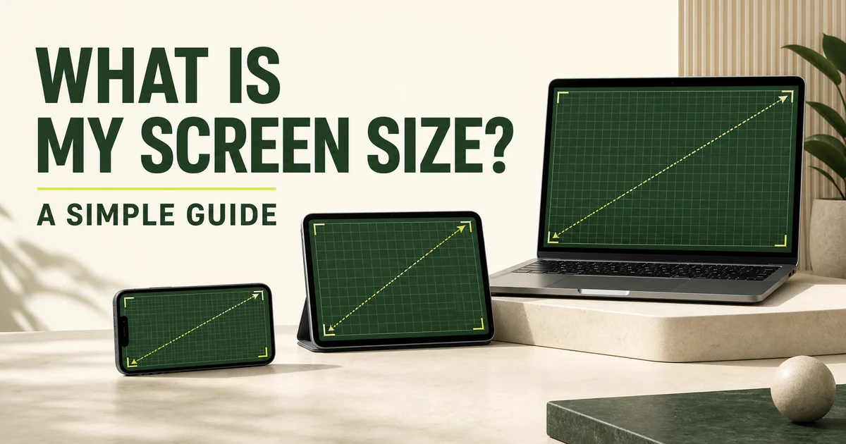
Manufacturers measure a screen diagonally from one visible corner to the opposite visible corner. The bezel or frame is not included. A laptop advertised as 15.6 inches has a display whose diagonal is approximately 15.6 inches, even though its width is much smaller.
Screen resolution
Resolution describes the pixel grid. A 1920 × 1080 display contains 1,920 pixels across and 1,080 pixels vertically. It is commonly called Full HD or 1080p. Resolution affects workspace and image detail, but it does not reveal the physical dimensions by itself.
Browser viewport size
The viewport is the space a webpage can use inside the browser. It changes when you resize the window, open a sidebar, rotate a phone, or use browser controls. Web developers rely on viewport dimensions to create layouts that work on phones, tablets, laptops, and desktops.
How to measure your physical screen size
If you need the actual size of your monitor or laptop display, a simple tape measure is the most reliable tool. Follow these steps:
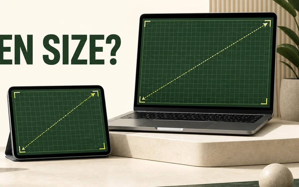
- Measure diagonally. Start at the bottom-left corner of the visible display and measure to the top-right corner.
- Exclude the bezel. Measure only the illuminated screen area, not the plastic or metal frame around it.
- Record inches or centimeters. Product names usually use inches. Divide centimeters by 2.54 to convert to inches.
- Check the model number. If measuring is inconvenient, search the device model on the manufacturer’s official specification page.
For a rough mathematical estimate, you can calculate a screen’s diagonal if you know its physical width and height: diagonal = √(width² + height²). Pixel resolution alone cannot provide an exact physical measurement because screens with different dimensions can use the same pixel grid.
Common screen sizes and resolutions
There is no single “best” screen size. The ideal choice depends on the device, viewing distance, resolution, and task. These ranges provide a useful starting point:
- Smartphones: roughly 5.8–6.9 inches, often using high-density Full HD+ or QHD+ displays.
- Tablets: roughly 8–13 inches, balancing portability with room for reading and creative work.
- Laptops: commonly 13–17 inches, with 14 and 15.6 inches among the most popular sizes.
- Desktop monitors: commonly 24–32 inches, often paired with 1080p, 1440p, or 4K resolution.
- Televisions: often 43–85 inches or larger, designed for longer viewing distances.
A 24-inch 1080p monitor can look crisp at a normal desk distance, while the same resolution may appear less sharp on a 32-inch monitor because the pixels are spread over a larger area. That relationship is expressed as pixels per inch, or PPI.
How to choose the right screen size
For everyday work
A 24–27-inch desktop monitor gives most people comfortable space for documents, email, and browser windows. A 1440p resolution is especially useful at 27 inches because it provides more usable workspace than 1080p while keeping text clear.
For gaming
Consider size, resolution, refresh rate, and graphics performance together. A larger or higher-resolution display requires more graphics power. Many gamers prefer 24–27 inches because the entire display remains visible without excessive head movement.
For design and photography
Resolution, color accuracy, and pixel density matter as much as diagonal size. A 27–32-inch 4K display offers detailed previews and generous room for creative tools, but accurate color calibration remains essential.
For responsive web testing
Focus on viewport width rather than physical inches. Test several widths, including compact mobile, tablet, laptop, and wide desktop layouts. The homepage detector reports both full screen and current viewport dimensions, making it useful for checking breakpoints quickly.
Frequently asked questions
How do I know my screen size?
For screen resolution, use the automatic detector on the MyScreenResolution homepage. For physical diagonal size, measure the visible display from one corner to the opposite corner, without including the bezel.
Is screen size the same as screen resolution?
No. Screen size is the physical diagonal measurement in inches or centimeters. Screen resolution is the number of pixels across and down the display, such as 1920 × 1080.
What is my browser viewport size?
Your viewport is the portion of the browser available to display a web page. It can be smaller than your full screen because browser toolbars and window borders use some space.
Can two screens have the same resolution but different sizes?
Yes. A 13-inch laptop and a 27-inch monitor can both use 1920 × 1080 resolution. The smaller screen will have a higher pixel density and typically look sharper at the same viewing distance.
See your screen details now.
Get your exact resolution, viewport, pixel ratio, aspect ratio, and color depth in one instant.
Check my screen size